;
HNA-PV – Resort Digital User Experience Design
HNA-PV TOURISM is a joint venture by one of the largest tourism groups in France and a Chinese property company. The client intends to launch a fresh leisure and holiday brand, featuring self-catering apartment residences, in the Chinese market. Diverging from conventional resorts, the concept is to offer a close-to-nature and family-friendly experience. Guests not only have the option to stay in self-catering apartments but can also engage in a lot of activities at the resort.
Company
HNA group, Pierre et Vacances
Country
China, France
Company
UX designer
Company
2018
About the Project
Project Goal
Build up 0-to-1 digital product experience for both website and app
The official website is designed to showcase the brand identity and introduce the new holiday brand
The app incorporates all the services and features that meet users’ need along the customer journey

Website
Build Website from Scratch
I led the product design for the website project, which served as the initial touch point for my client with the Chinese audience. This website catered to both holiday enthusiasts and potential property investors interested in understanding more about self-catering apartment tourism. My goal was to ensure that visitors could easily comprehend the novel tourism residence option from Europe and vividly experience the relaxed holiday atmosphere through effective brand communication and emotional design.
Design Goal
Deliver brand personality and image
Build an immersive browsing experience
Enhance the brand credibility with content & design
Outcome
The final design deliverable exceeded the client’s expectations.
Design
Immersive Holiday Atmosphere
On the landing page, we design four illustration covers that auto plays according to the time of a day to show scenes of the resort.
Brand Introduction Page Design
I studied all the given materials about company introduction by the client and service operation planning blueprint done by my coworkers. I boiled down the key content to articulate the brand values and products including environment, facilities, cottages, activities, residency locations and travel tips. Visitors will be able to understand the brand and its values.
One-stop App
Background
The APP was aimed to provide all the services people might need through the user journey like planning a trip, visiting a resort and finishing a trip. People were able to book accommodation and activities in the resort in advance and go on vacation without hassle.
Co-creation Workshop with Client
We organized a workshop where we facilitated the client to jot down ideas about the service they would like to provide to customers while adhering to user and business values.
Outcome
The client expressed satisfaction with the website and mobile app deliverables, prompting us to extend our collaboration on another project—an app designed for the employee side.
Design
Design Concept
The brand values my client wished to deliver were to allow people to disconnect from the ordinary busy life and reconnect with other travelers at the resort. Apart from that, we wanted to provide customers with efficient booking experience and 24/7 online assistance. As a result, we conceived a design concept called “A Fairy in a Bottle”, a helpful online assistant that provided service to people with hospitality.

Fairy
The fairy as a helper assists resort visitors in answering the frequently asked questions and guiding them to finish the task based on the scenario.

Bottle
Bottle stands for the dreamland resort that disconnects people from outside of the world.
Design Challenge
The client initially had draft business rules and operational plans rather than well-defined ones. To encourage them to dive deeper into these essential aspects, we began by creating a preliminary wireframe for the top-priority features. We engaged in discussions with the client to gather feedback and swiftly iterated the design.
Homepage Design Based on User Registration Status
We crafted two distinct versions of the homepage based on the user’s login status. For users who are signed out, the design guides them to log in for more efficient trip planning. On the other hand, for signed-in users, the homepage displays information about their upcoming trips.

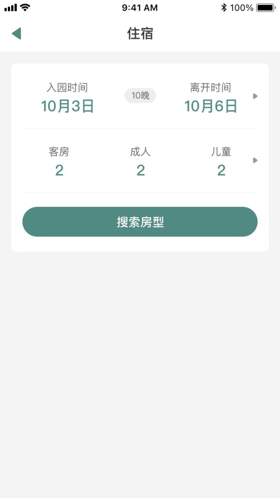
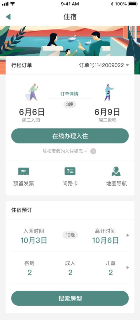
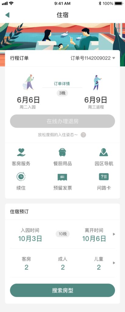
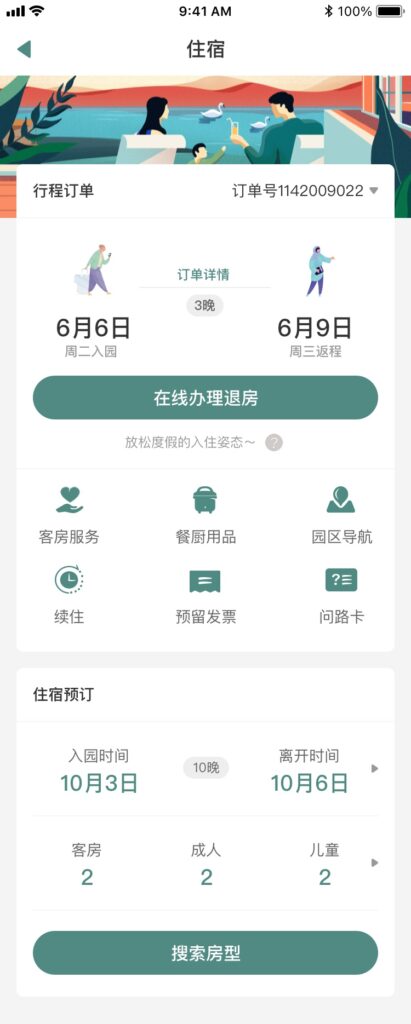
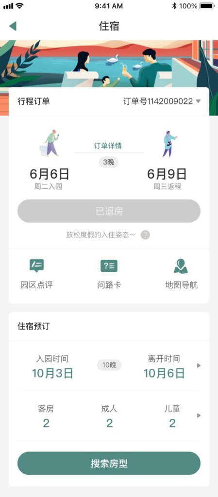
Scenario-Based Room Booking Design
Taking into account various order statuses such as pre-booking, check-in, and check-out, I created distinct UIs for the room booking page corresponding to each status. For instance, in the default status, the primary user task is to place an order. After check-in, additional service features like room service, resort navigation, and catering are provided to enhance the experience for resort guests.
