GrabHealth – Cart Abandonment Research and Design Enhancement
Together with Ping An Good Doctor China, Grab launched a telemedicine service that caters to the SEA market. As a newly established venture, known as Good Doctor Technology, the team sets up a healthcare service that allows users to consult with doctors online, make medical purchases, and learn more about healthcare through freshly produced articles.
After we launched the product, we’ve learned that a lot of users added prescribed drugs to shopping carts yet never placed orders. As a result, the drop-off rate between adding to cart and placing an order remains high.
Company
Good doctor technology
Contry
Singapore, Indonesia
Role
User researcher, product designer
Time
2020
About the Project
Product Objective
Dive deep on the rationale for decision-making process of placing prescription orders
Increase the experience of the customer journey from consultation to purchase
Biz Objective
Increase order placed rate
Outcome
Order placed rate has a uplift of 1.8%
UX Research
Research Objective
To explore and probe on the reasons users added recommended medicines to cart, but abandoned the cart afterwards
To explore other potential factors that affect users’ decision-making process about purchasing recommended medicines
Research Method
Phone interview, survey
Sample Size
1,000+
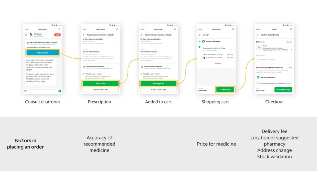
Key Findings
Most factors in decision-making of placing orders appear after adding items to cart
Reflects why the drop-off rate was extremely high between add-to-cart and order place rate as most of users would just add prescription drugs to carts first and assessed whether to buy with all the underlying factors later.
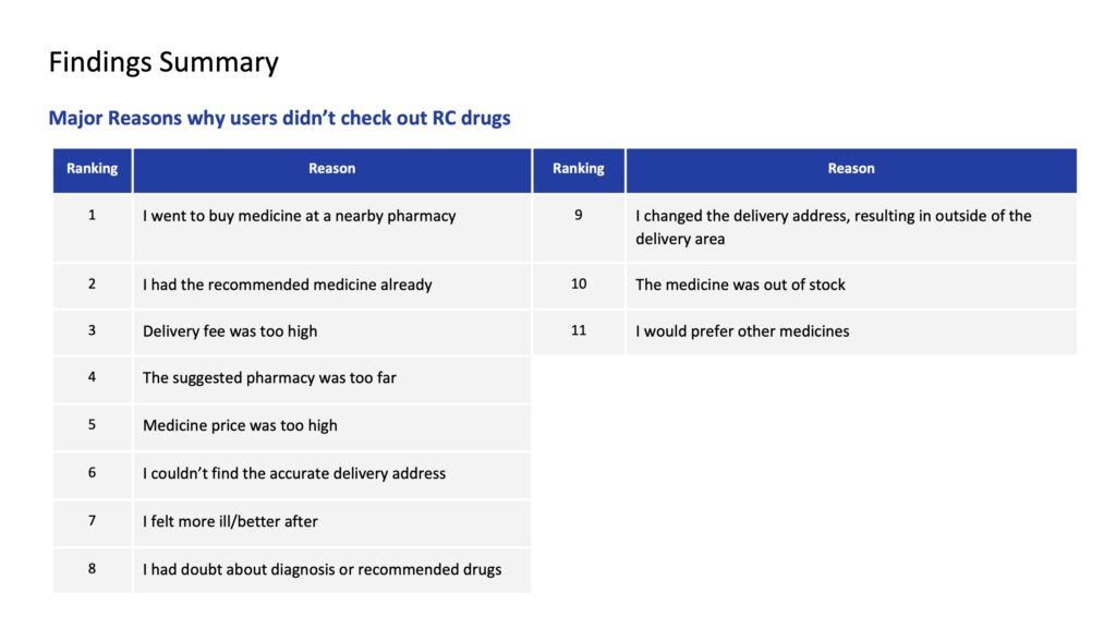
Up to 25% of users went to buy medicines at a nearby pharmacy
Chances are they think suggested pharmacies were too far, the drug and delivery fee was higher, as a result, they would prefer to buy at nearby pharmacies.
Consultation satisfaction is relevant to meds purchase
Degree of satisfaction about consultation experience is relevant to buying prescribed medicines. The odds of checking out the medicines are higher if users have positive feedback on consultation.
Design
#1 Prescription medicine checkout experience: Offer users an alternative to purchase wanted prescription drugs only
Problem Space
Users mentioned they had some of recommended meds already. They gave up placing orders because they were only allowed to purchase the whole prescribed drugs.
Design Hypothesis
If we make quantities of drug items adjustable, users would have a better checkout experience and be able to buy partial prescription drugs.
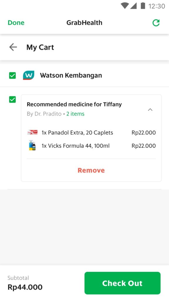
Old version
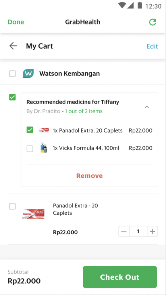
New version
#2 Checkout experience: Keep users informed with delivery time
Problem Space
Some users mentioned that they didn’t know how long the delivery time was as the app didn’t indicate, so when they saw the suggested pharmacy was far from their home, they expected a longer delivery time. Hence, they would rather go to nearby physical pharmacies to buy medicines.
Design Hypothesis
If we add the indication of delivery time estimation on the checkout page, users will be informed of delivery time.
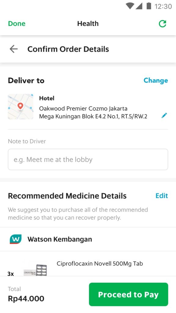
Old version
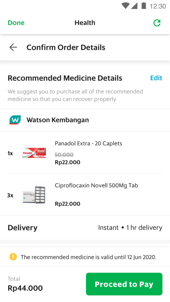
New version
;
